The Collective Service
How a health-emergency partnership’s website was rebuilt from the ground up, with a new identity, so that people on slow connections can reach current guidance. Now in testing before its relaunch.
- Type
- Partnership
- Year
- 2026
- Scope
- Website audit, complete rebuild, brand identity and document library
- Languages
- English first, more planned
- Status
- In testing. Not yet launched
- Home page as it opens on a phone, against a 500 KB budget. Measured 24 October 2026
- 283 KB
- Page templates measured against WCAG 2.2 AA. Measured 22 October 2026
- 30
- Documents read into the Knowledge bank. Measured 4 November 2026
- 279
The challenge
The Collective Service is a global partnership for risk communication and community engagement in health emergencies. Its website was set up in 2020 as a central library of guidance. It is still the partnership’s front door: the place coordinators and responders go for tools, training and data when they have to reach communities during an outbreak.
Six years on, the site was still shaped by the pandemic it was built for. Most of its library dated from 2020 to 2022, while the emergencies people were working on had moved on.
The people who most need it are also the hardest to reach. In a 2022 survey of people sharing emergency-health course content, poor connectivity was the most-cited difficulty in low-income countries, at 29%, against 8% in high-income countries. The median home page on a phone was 2.56 MB in 2025, which takes about 51 seconds at 400 kilobits per second. That is too long for a coordinator who needs a document now.
The partnership had a recognition problem too. A 2023 evaluation found its name confusing for some and its purpose under-communicated. Its logo was the name alone, so it could not help.
The goals
- Make every page light enough for a slow connection, with a budget of 500 KB a page.
- Bring current guidance to the front and retire what is out of date.
- Build a document library with search, emergency kits and redirects from every old address.
- Hand the site to the partnership’s own editors, with testing, training and a relaunch.
Key decisions
Rebuild from the ground up
Updating the old site page by page would have kept the structure and weight it needed to lose. So every page was rebuilt: a custom WordPress theme of 30 page templates, a new editing side, and content brought across through a repeatable importer that can be rerun and checked.
Set the weight limit before the design
One rule sat behind the design: when audiences conflict, responders win. So every page had to stay under 500 KB, about 10 seconds at 400 kilobits per second, and that limit was set first, so every template was built to it. Each download also states its format and size before it is pressed, so nobody spends scarce data on a file they did not expect.
Hold every document on the site
Many documents were only linked to, so they would stop working if a publisher moved a page. We fetched 155 of them, so the site now holds its own copies, with French, Portuguese, Spanish and Swahili versions where publishers offer them. Documents listed two, three or four times now appear once, with their other languages on the same page.
Treat the brand as part of the problem
A better website could not, on its own, explain what the Service is. So we made the case for a new identity alongside it. The reasons are set out below, under The brand.
Build for the people who will run it
A library only stays current if its own team can keep it current. The editing side has one form for each kind of content, and each form lists what is still missing before it can be published. Adding a document means pasting its address: its format, size and page count fill in by themselves. A built-in guide shows editors each job, screen by screen.
Try a new way into the library
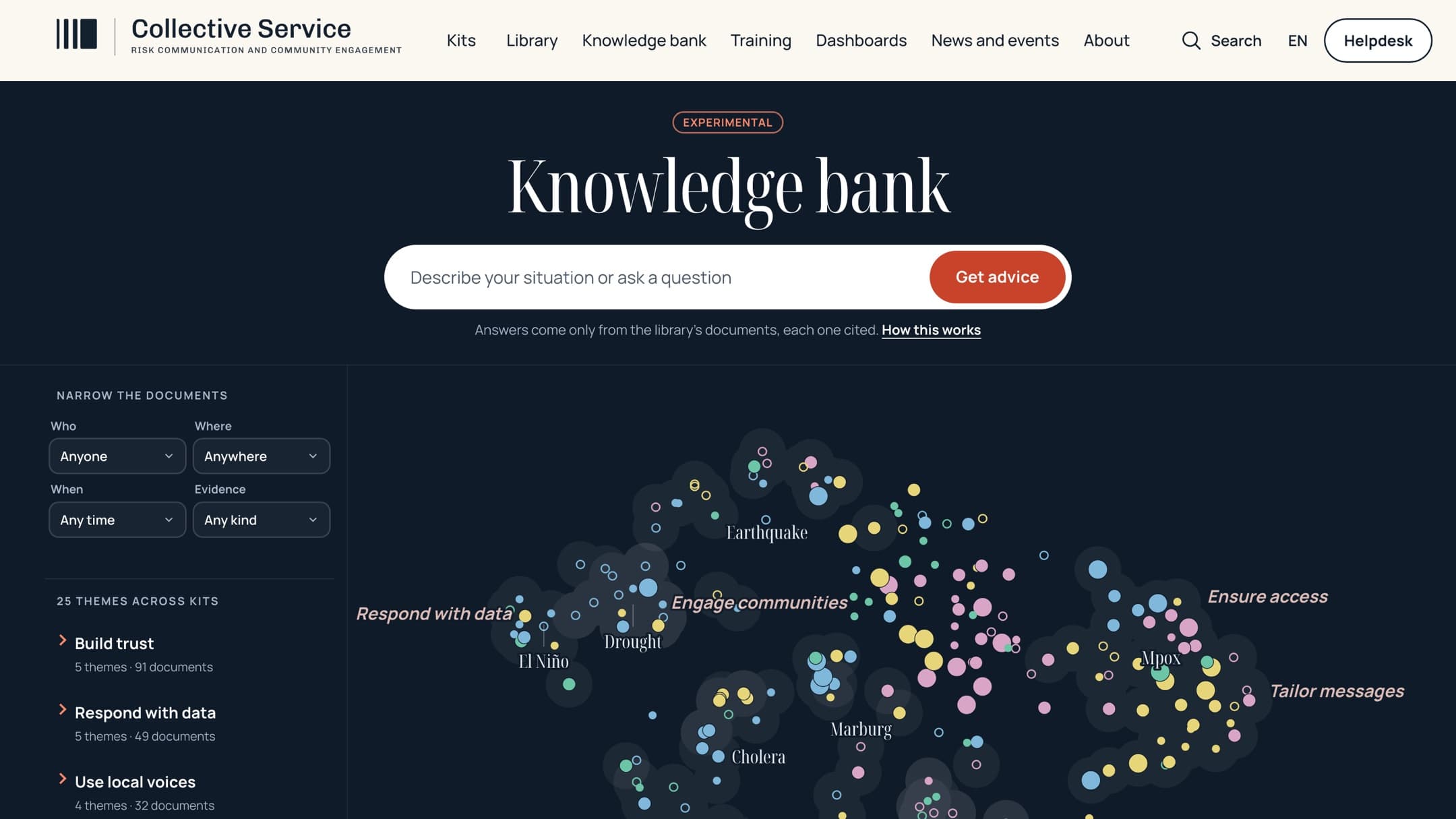
Search only helps people who know the right words. The Knowledge bank lets a reader describe a situation in their own words and get advice drawn only from the library’s documents, with every point cited. When the library has no answer, it says so. It is an experimental part of the build.
The brand
The new identity began with the partnership’s own evidence, not with the logo. A 2023 independent evaluation, built on 88 interviews, 98 survey responses and four country case studies, found the name “confusing for some” and listed “limited communication about its purpose” as a weakness. It also found that 87% of respondents thought they were likely to need the Service in a future health emergency. So this had to be an identity built to last, and one that helps explain what the Service is.
The existing logo was made to put a name on a pandemic response, and it did that job. It had not been asked to do more. A logo that is only the name cannot explain a name people find confusing, so the identity needed a form that carries the idea: organisations acting as one, so that communities are listened to in an emergency.
It says what the Service is
Three separate parts join one body: distinct organisations, drawn as equals, becoming one service. A reader sees “together” before reading a word, so the mark works on the confusion the evaluation found every time it appears.
It keeps the partners equal
The Service is a partnership of equals. No part of the mark takes precedence, and a single quiet colour lets it sit beside four established logos without crowding them.
It matches how the partners work
Each partner pairs a symbol with its name. The Service was the only member of its own partnership without one.
It works in every language
The Service publishes in English, French, Portuguese and Spanish, and much of its work is in francophone and lusophone Africa. A symbol works in all of them. The name stays in English and the line beneath it is translated.
It works wherever the Service appears
The Service is increasingly found in feeds, browser tabs, group chats and on phones, where a wordmark cannot be read. Solid shapes also survive the stamps, badges and photocopies of field materials. Size was only one test of eight. Both logos were tested on meaning, small sizes, reusable parts, sitting with the partners, matching the voice, reliable reproduction, distinctiveness and whether rules can govern them.
It survives a change of name
The evaluation recommended that the partners consider changing the name. If they do, the mark stays and only the words beside it change.
It rests on evidence, at low risk
A 2019 study in the Journal of Marketing Research, across six experiments and 597 logos, found that more descriptive logos are easier to take in and are judged more authentic, most of all for brands people do not yet know well. The cost of changing is low: the name, where the recognition lives, stays, and the mark is one small file using fonts the site already loads. The risk of not changing is that the evaluation’s findings stay unaddressed at the most visible layer.
The brand guidelines
The identity goes further than the mark. The voice is plain, concrete, calm and honest, because jargon is a barrier to someone in the middle of a crisis. Colour has a job: ink for text, sand for backgrounds, and coral only for what is live now and the one action that matters.
All of this is set out in a 57-page design and brand document, shared with the partnership in October 2026. Part A makes the case and sets the guidelines: the evidence, the side-by-side tests, the cost and risk of changing, voice and tone, construction, clear space and minimum sizes, colour, type, photography, four language versions, use beside the partners and the rules. Part B is the design standard for the website, and every rule in it carries its reason and the kind of support behind it: the terms of reference, published evidence, a computed value, a standard or our own judgement.
The new mark is a proposal. The decision rests with the partners, and the new site carries it in the meantime.
Before and after
The website
- Before
- The site set up in 2020
- After
- Rebuilt from the ground up, with 30 page templates
The library
- Before
- Mostly from 2020 to 2022
- After
- Current guidance first, with out-of-date material left out
Documents
- Before
- Many only linked to on other sites
- After
- Held by the site itself, including 155 fetched from publishers
Repeated entries
- Before
- Some listed up to four times
- After
- Each listed once, with its languages together
The logo
- Before
- The name alone, in English
- After
- A proposed mark that works in any language and at any size
Old addresses
- Before
- 1,593 across the old site
- After
- Every one mapped to a place on the new site
The result
The site has not launched, so there are no visitor results to report yet. Until the relaunch, the partnership’s public address still shows the old site.
What can be reported is what was tested. On 23 October 2026 a crawl of 332 pages and 634 links to other sites found none broken. Every page is checked from 320 to 1,920 pixels wide. Visitor measurement is built in and loads only after a visitor consents, so the relaunch can be judged on real use.
What we learned
- Count before you design. Reading the site’s own database, rather than estimating from a crawl, showed how much of the library belonged to another time, and that changed the plan.
- Weight is a design decision. Set the limit first and every template is built to it.
- Make the case for a brand with evidence. Setting out the findings, the tests and the cost of change lets partners decide on the argument, not on taste.
- Show people real pages. Reviewers pinned comments to the working site, so each point was about something they could see and could be tracked to a fix or a decision.
Standards met
- Accessibility
- WCAG 2.2 AA on all 30 page templates, by scripted tests in headless Chrome with real keyboard input, at desktop and phone widths. Other organisations’ PDFs and embedded reports are excepted. A screen-reader test by a person is part of the final review.
- Languages
- English. Where publishers offer them, documents also carry their French, Portuguese, Spanish and Swahili versions.
- Performance
- 500 KB budget, about 10 seconds at 400 kilobits per second. The home page is 245 KB to 283 KB as it opens on a phone, and 530 KB to 563 KB if scrolled to the very end.
- Security
- Three layers of backup: host restore points, a nightly database copy and the code repository, checked by script.
Team
- Project lead
- Matthew Bowman
- Client team
- The Collective Service Secretariat